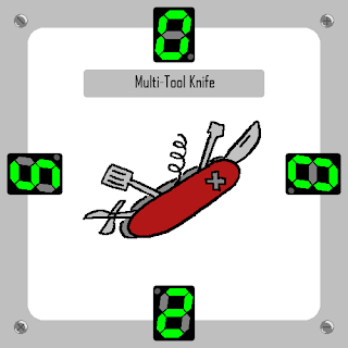
I have drafted more of the digitally drawn version of the This Way Up! cards using Adobe Photoshop, using the Pencil Tools to keep the art on the card consistent in sharpness to the border and interface.
One change I do want to make to each of these cards is to have the non-green segments on the display a little darker, so that each number can be more easily read. The small dot to tell the players what side a number is supposed to be read from, will be coloured the same green as the numbers to make sure that it is easier to identify.
A lot of the different items (as well as the way they are drawn) are inspired by the game The Binding Of Isaac, in which the artstyle of said game has the collectable items cel-shaded with sprite art, prominanly featuring a thick black outline around the border.
This blog was written during my studies at the University Of Central Lancashire to catalogue and archive my development of the various projects I worked on.
Tuesday, July 4, 2023
XB4406: MA Games Design: This Way Up! Digital Cards development
Subscribe to:
Post Comments (Atom)
XB4406: MA Games Design: This Way Up!: Extra Background Card Designs
My next step with This Way Up! was to implement different card backgrounds, based on the importance and severity of some of the objects in ...

-
The logo for Chesspionage has now been designed, with the core themes of Chess's visuals in mind, a black and white checkerboard, with t...
-
The next blog post for the development of This Way Up! is for the almost complete collection of art and statistics for each card in the game...


No comments:
Post a Comment